Introduction
In this blog we will create a simple Power BI report for HR using dynamic measures. As mentioned in previous posts in this series, we are using the Adventure Works sample databases (AdventureWorks2017 and AdventureWorksDW2017). In this post we could choose to work entirely with the OLTP AdventureWorks2017 database as it contains all the information we need. However, we are doing reporting and analytics and these are the tasks for which OLAP systems are designed. The OLAP system AdventureWorksDW2017, however, doesn’t contain all the information we require to complete our report, so we will use the OLAP data warehouse but also get whatever extra data we need from the OLTP system.
Throughout creating this report I have taken a large number of screenshots to aid reproducibility. Only some of these made it into this blog post. All of the screenshots will be available in the github repository. If you have difficulty following one of the steps below, I encourage you to go check it out.
Before we begin, we want to emphasise that the data in these databases is not current, in fact, the most current date is 12/07/2014. This can be determined by writing an SQL query in SQL Server or in Power BI by creating a measure. For example, in Power BI we can create a measure using the “Sales SalesOrderHeader” table from the OLTP system using the following DAX code:
"Current" Date =
VAR MxOD = MAX('Sales SalesOrderHeader'[OrderDate])
VAR MxDD = MAX('Sales SalesOrderHeader'[DueDate])
VAR MxSD = MAX('Sales SalesOrderHeader'[ShipDate])
VAR MxTemp = MAX(MxOD,MxDD)
RETURN MAX(MxTemp,MxSD)
Since we have no further use for this table, we will not import it. Instead we will just take this date as a given fact.
Data Preparation
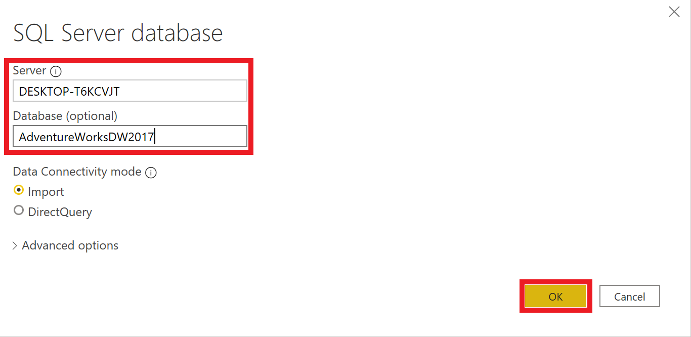
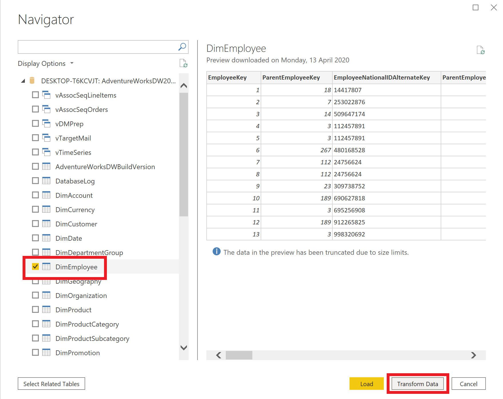
The first thing we need to do is get our data and then prepare it for our report. In this report we will be using the DimEmployee table from the OLAP system. Go to Home > Get Data > SQL Server in the ribbon menu at the top of the screen. Connect to the AdventureWorksDW2017 by entering your server name and the database name. Once connected to the database, load only the DimEmployee table by selecting it in the list and clicking Transform Data.
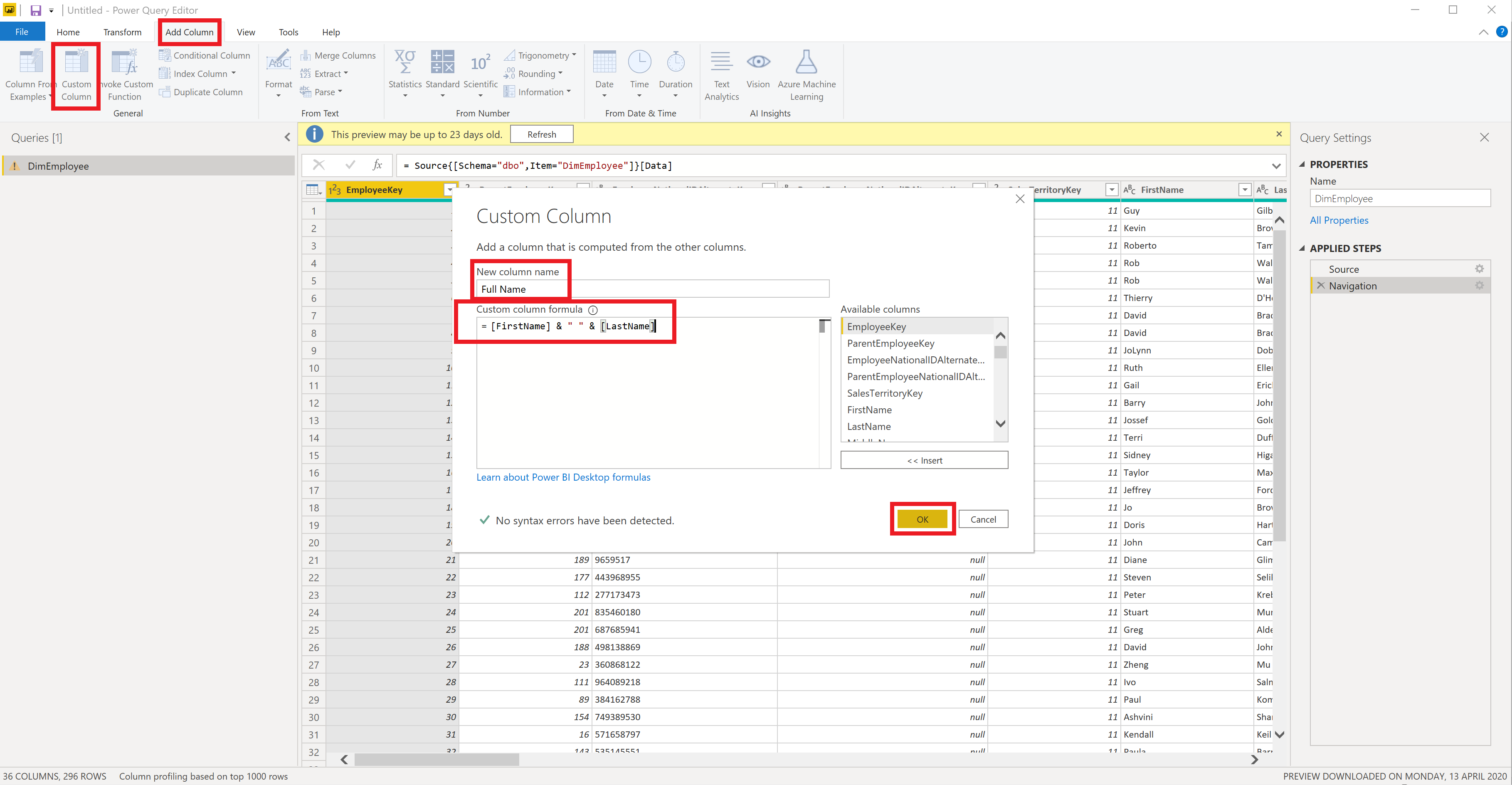
Now we are in Power Query. Here we will do quite a few things. First we will want to create some new columns. Click on Add Column > Custom Column in the Power Query ribbon menu to add a new column. We will create 3 new columns this way using the M language. They are Full Name, Age and Years with the Company. The M language code for these new columns is as follows:
-
Full Name: [FirstName] & ” ” & [LastName]
-
Age: Number.RoundDown(Duration.TotalDays(Date.FromText(“2014-07-12”) - [BirthDate] ) / 365)
-
Years with Company: Number.RoundDown(Duration.TotalDays(Date.FromText(“2014-07-12”) - [HireDate] )) / 365
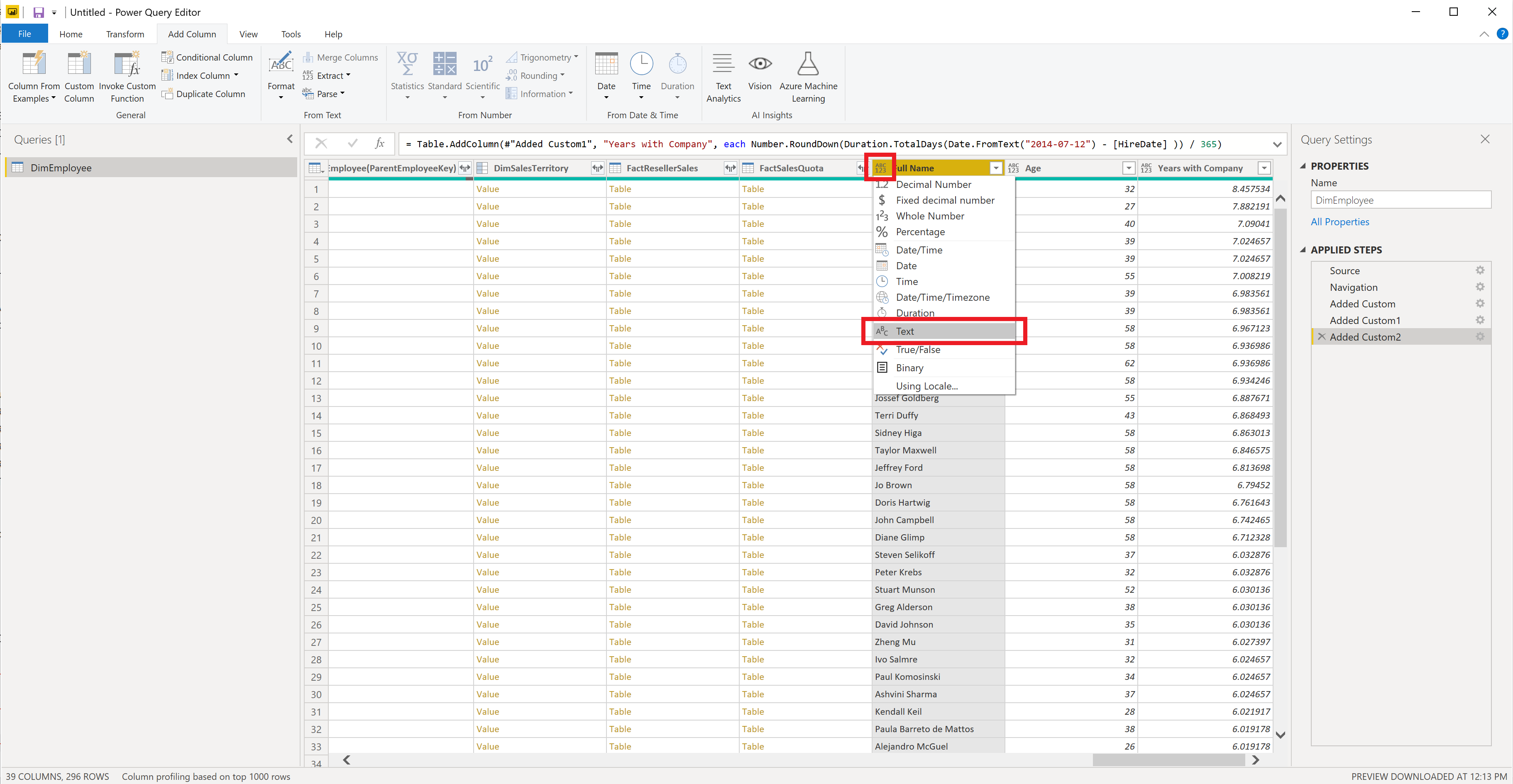
The next step is to change the default types for these new columns by clicking on the data type symbol on the left of the column name and select the appropriate type, i.e., change
-
Full Name to text
-
Age to whole number
-
Years with Company to decimal
We do not need all the columns in this table. To reduce the size of our report we will drop all unwanted columns. In addition to the three columns created above we will also be using:
- EmployeeKey
- Title
- EmailAddress
- Phone
- MaritalStatus
- SalariedFlag
- Gender
- BaseRate
- VacationHours
- SickLeaveHours
- DepartmentName
- StartDate
- EndDate
One might think we should include CurrentFlag, but as it turns out, all the employees in this table are current. We select the desired columns by holding Ctrl and left clicking on column name. Once all desired columns are selected right click on one of the column headers and select Remove Other Columns.
Now that we have prepared the data from this database we will Click on Home > Close & Apply. At this point we can save it by going to File > Save As and naming it (I have named it AW-3-HR-PBI-Report-Dynamic-Measures).
Before we start creating our report we will get the extra data we require from the OLTP system. To do this, do as before by clicking on Get Data > SQL Server and enter your server name again and this time use AdventureWorks2017 for the database name. From this database we will only need four tables:
- HumanResources.Department
- HumanResources.EmployeeDepartmentHistory
- HumanResources.Shift
- Person.EmailAddress
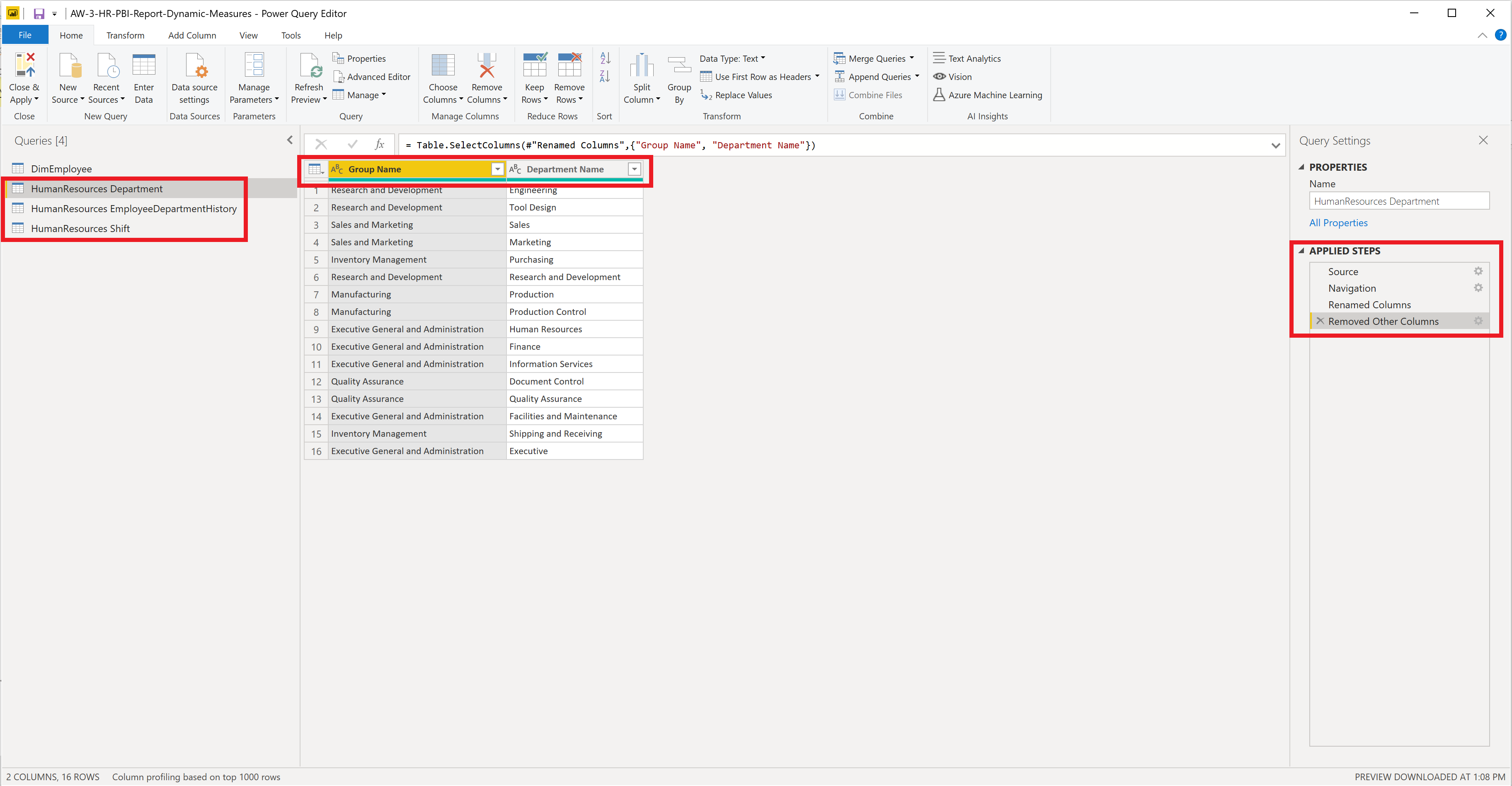
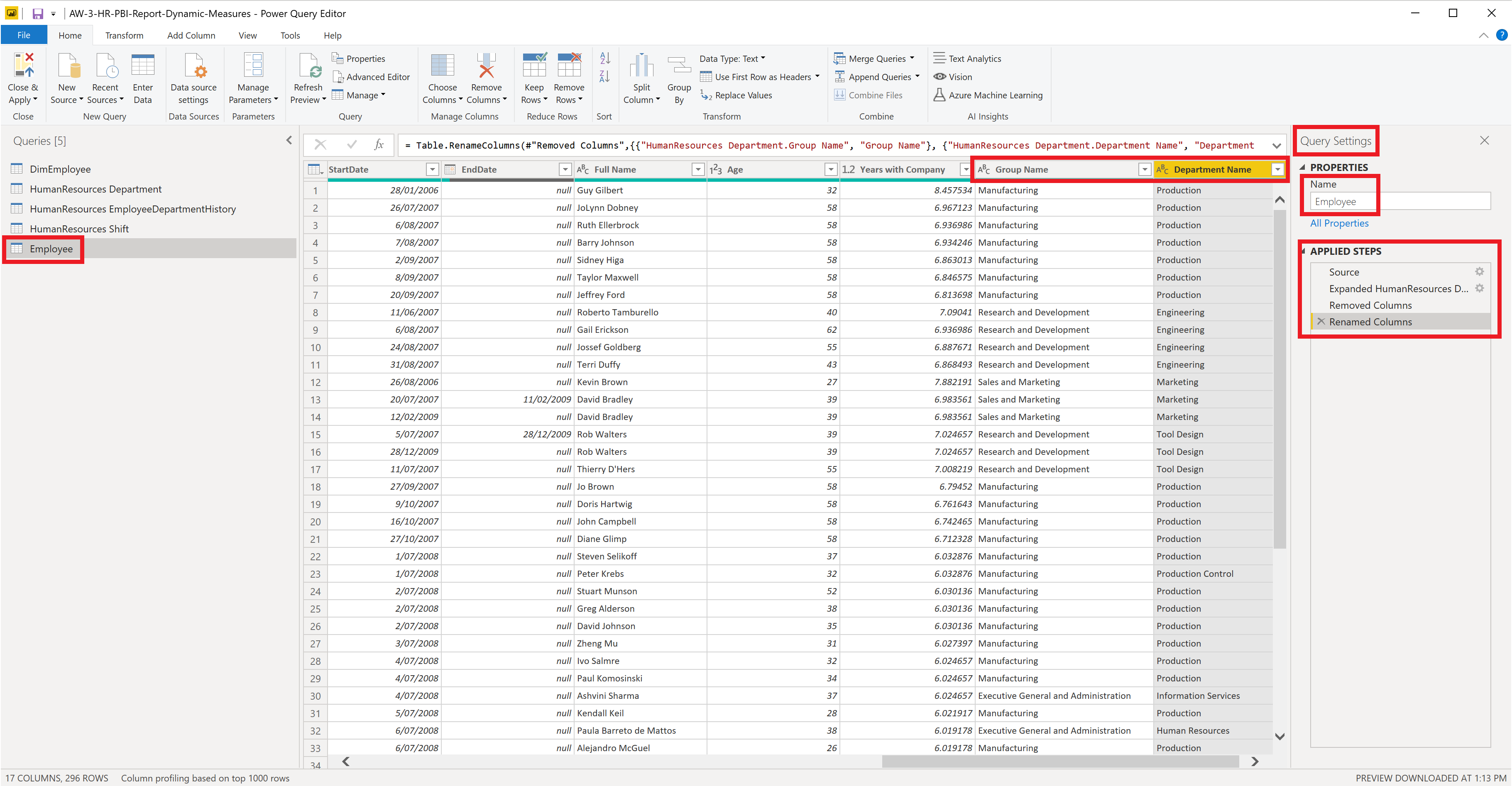
Remember to click Transform Data as we will need to transform this data and merge it with the DimEmployee table. We will drop unwanted columns from these new tables and then merge it. We first consider the HumanResources Department table where we only keep the columns Name and GroupName. We rename these columns to Department Name and Group Name, respectively, by clicking on their column headers.
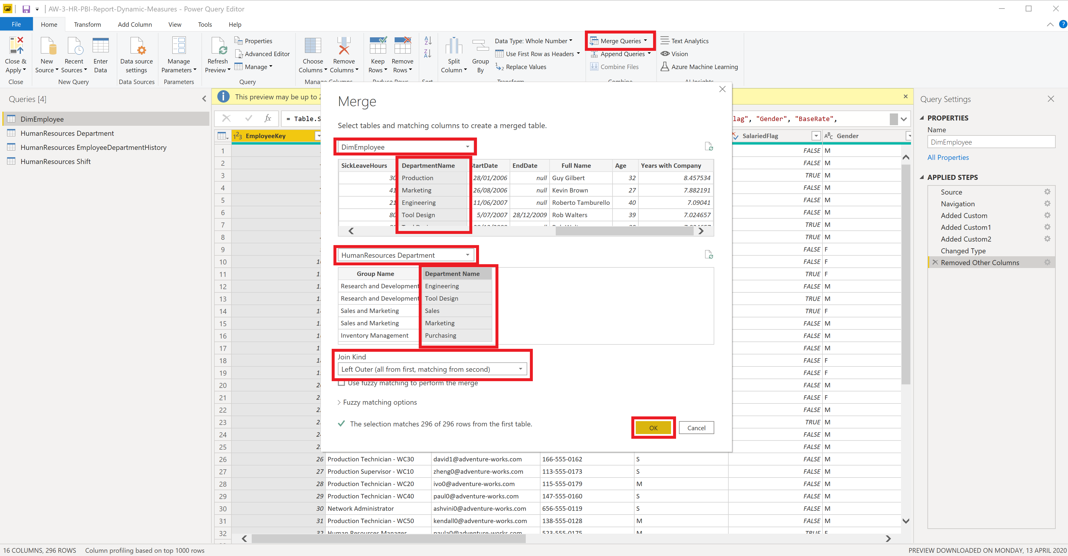
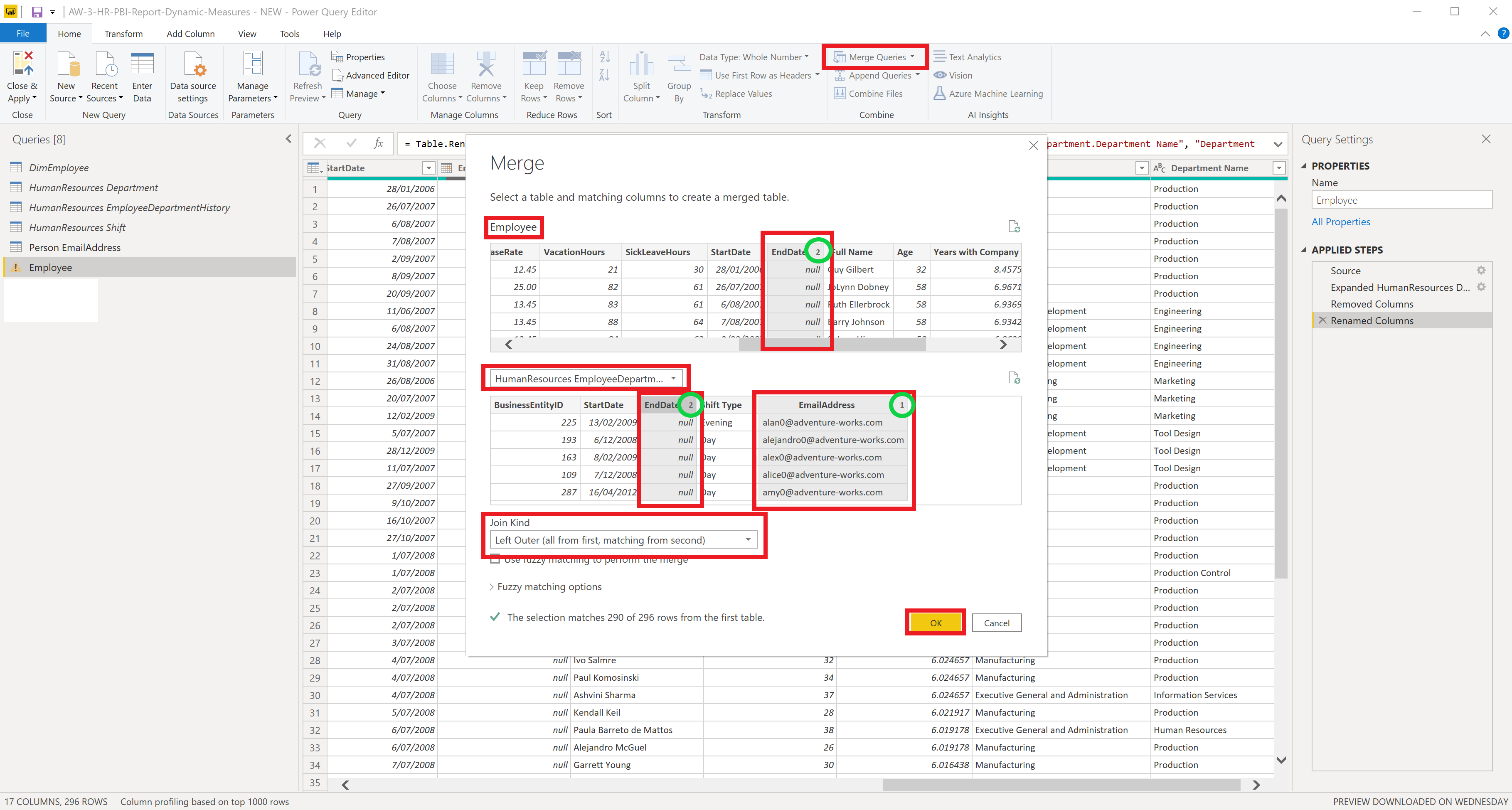
Now we merge this table with DimEmployee by clicking on Merge Queries > Merge Queries as New. Select the DimEmployee table and the DepartmentName column and the HumanResources Deparment and its Department Name column. For the Join Kind select Left Outer.
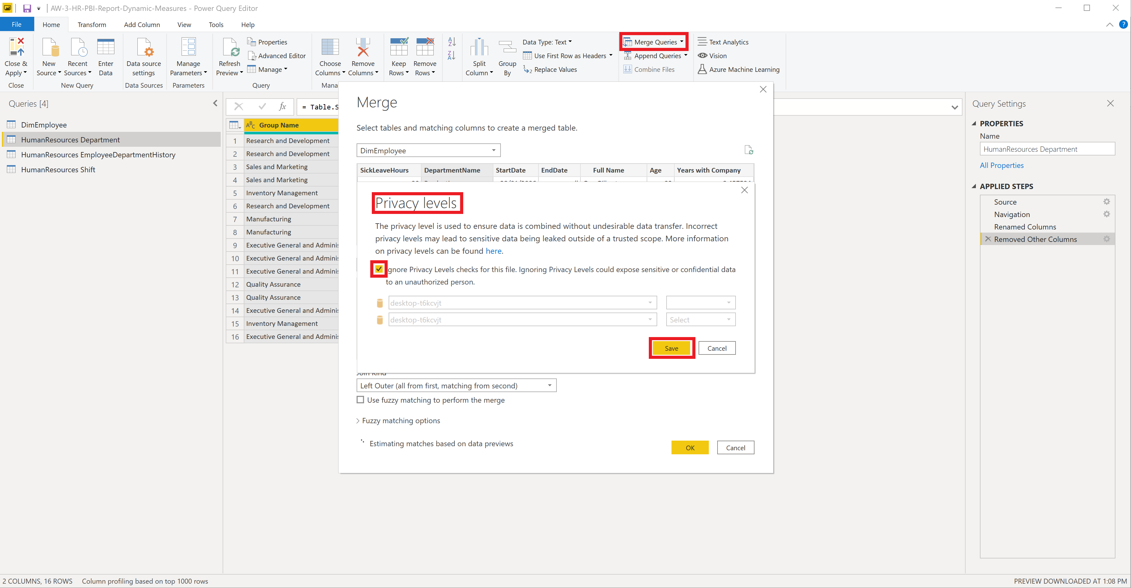
If you get asked about privacy levels select ignore and click save.
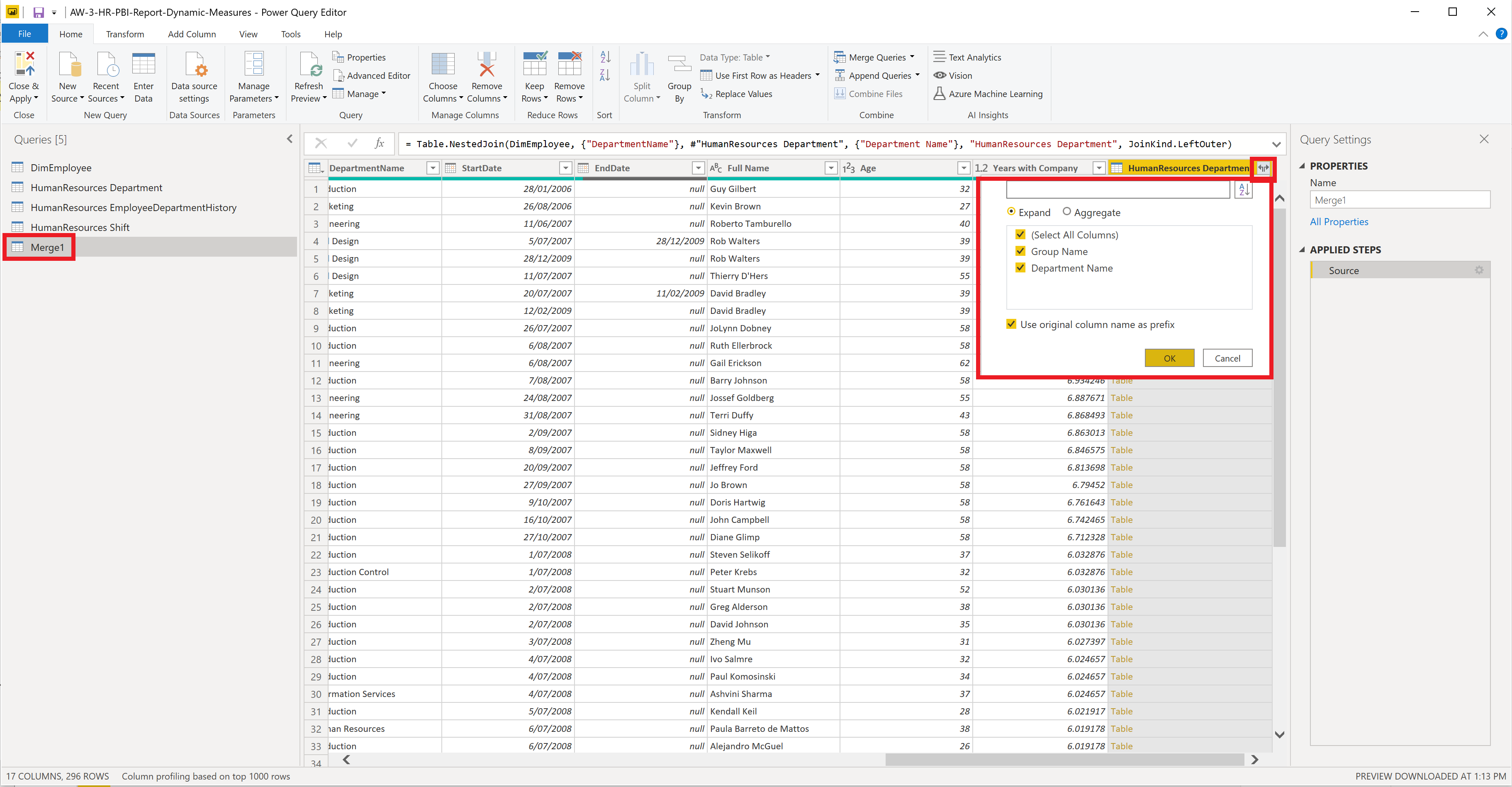
It appears as a new table called Merge1. Scroll to the far right and you will see all of the DimEmployee columns and a new column called HumanResources Department. Click on the two outward pointing arrows next to the column header. Select all columns to be kept and click ok. Now you have two new columns, one of which is the same as the DepartmentName that was originally in DimEmployee. We will drop the original and rename the two new columns as Department Name and Group Name. We also rename the table as Employee in the Query Settings.
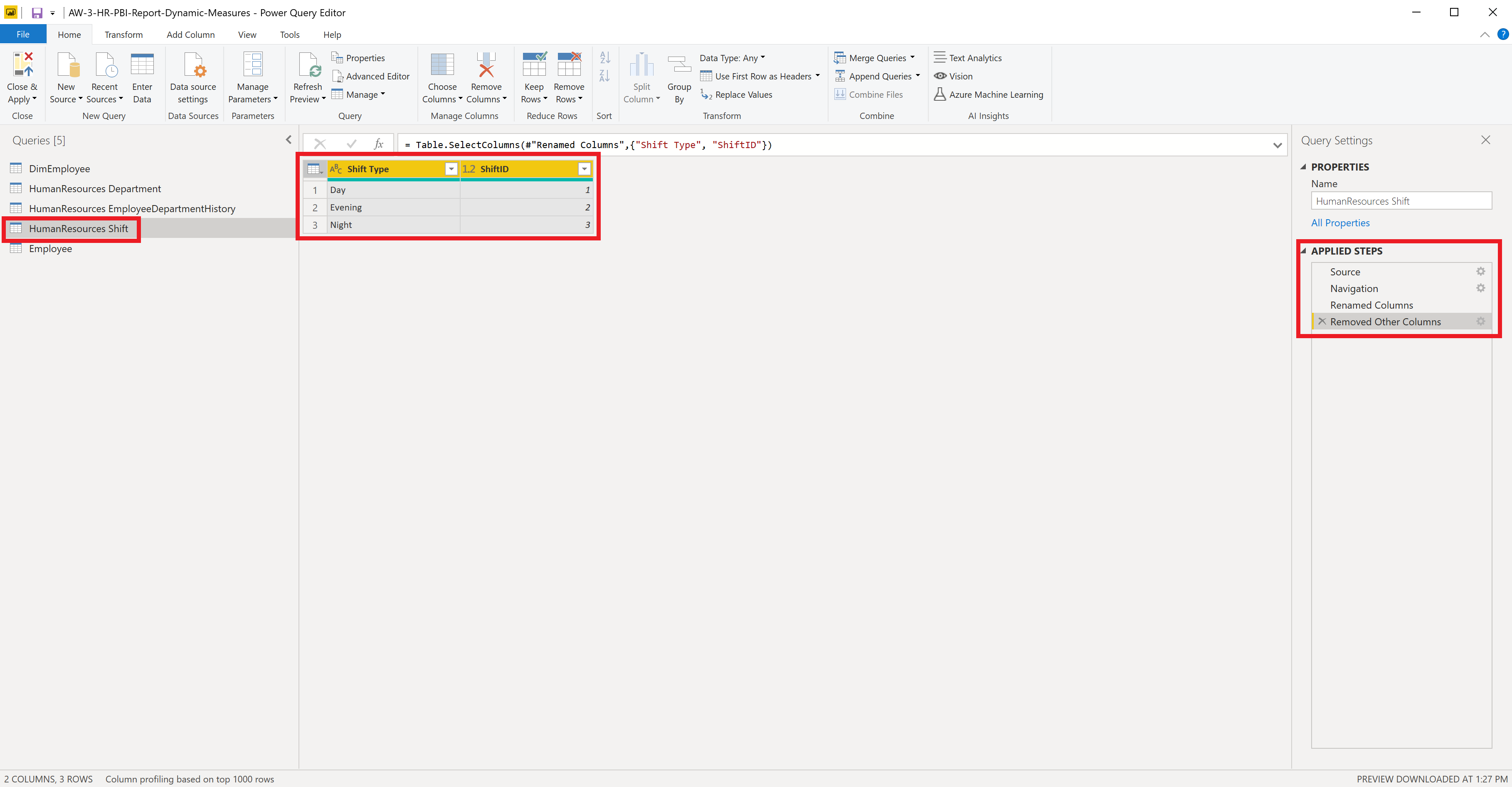
For the HumanResources Shift table we rename the column Name to Shift Type and only keep ShiftID and Shift Type.
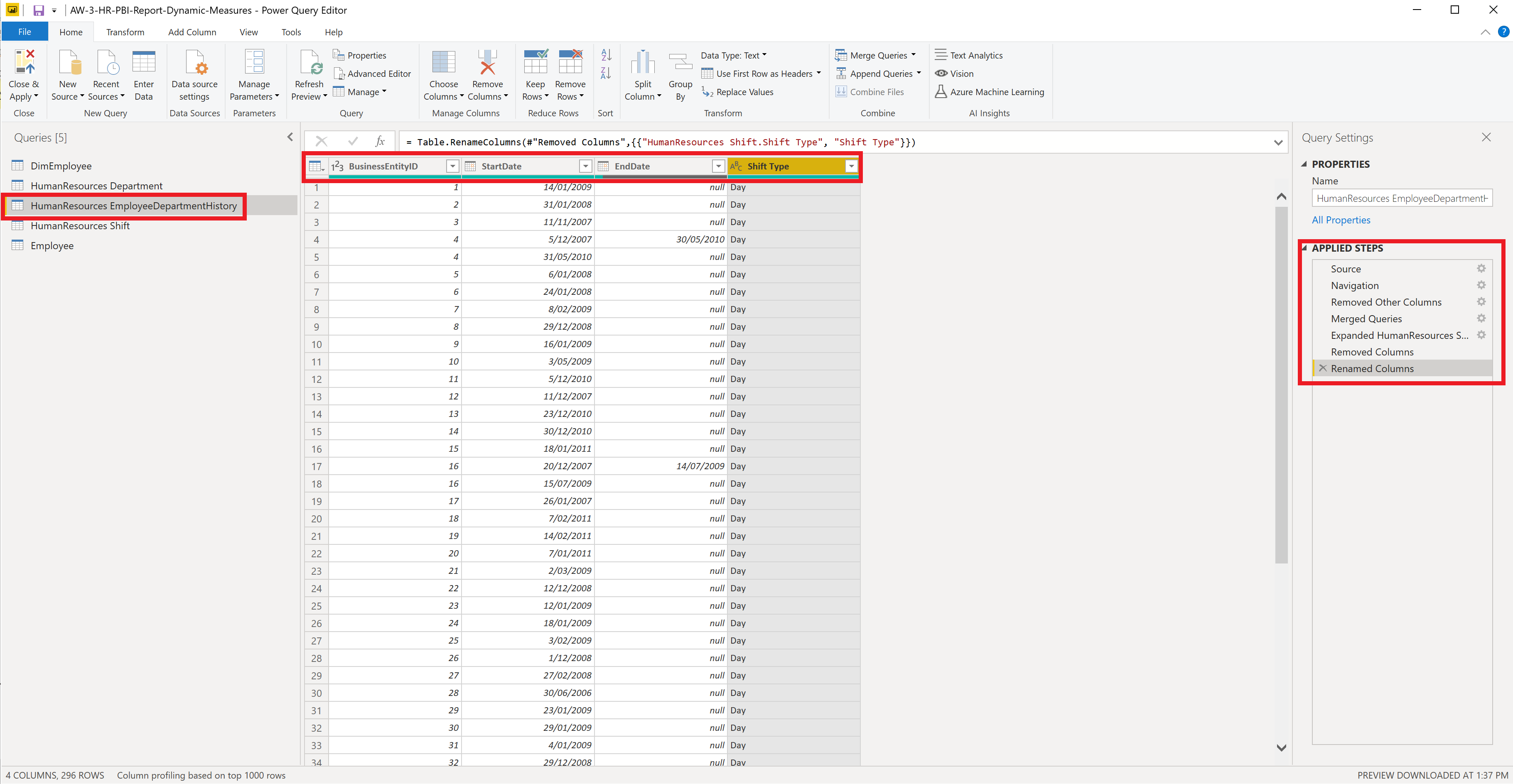
For HumanResources EmployeeDepartmentHistory we keep BusinessEntityID which is NOT the same as EmployeeKey in the DimEmployee and Employee tables. We also keep ShiftID, StartDate and EndDate which correspond to the similarly named columns in the other tables.
We merge HumanResources EmployeeDepartmentHistory with HumanResources Shift on ShiftID using Merge Queries > Merge Queries. Click on the double arrows in the new column header as done before. Select Shift Type. Now drop ShiftID and rename the new column to Shift Type.
We noticed by looking at the data that EmployeeKey appears to be unique for each position a person may have. For example Rob Walters has had two positions. For his first he had the EmployeeKey 4 and for the second and current one he had the value 5. Whereas BusinessEntityID is unique for each employee at Adventure Works. This value is not available in the data warehouse, so to find out how EmployeeKey and BusinessEntityID are related to one another we do so by the employee email addresses which are also unique for each employee and this information is available in both the OLTP and OLAP system. It is in the DimEmployee table in the OLAP system and in Person EmailAddress table in the OLTP table.
We have not yet loaded the Person EmailAddress table, we can do this by going to Home > New Source > SQL Server and connecting as we did before to the OLTP system. In this table we only need the BusinessEntityID and EmailAddress columns, we remove all others, then merge this query with HumanResources EmployeeDepartmentHistory on the EmailAddress.
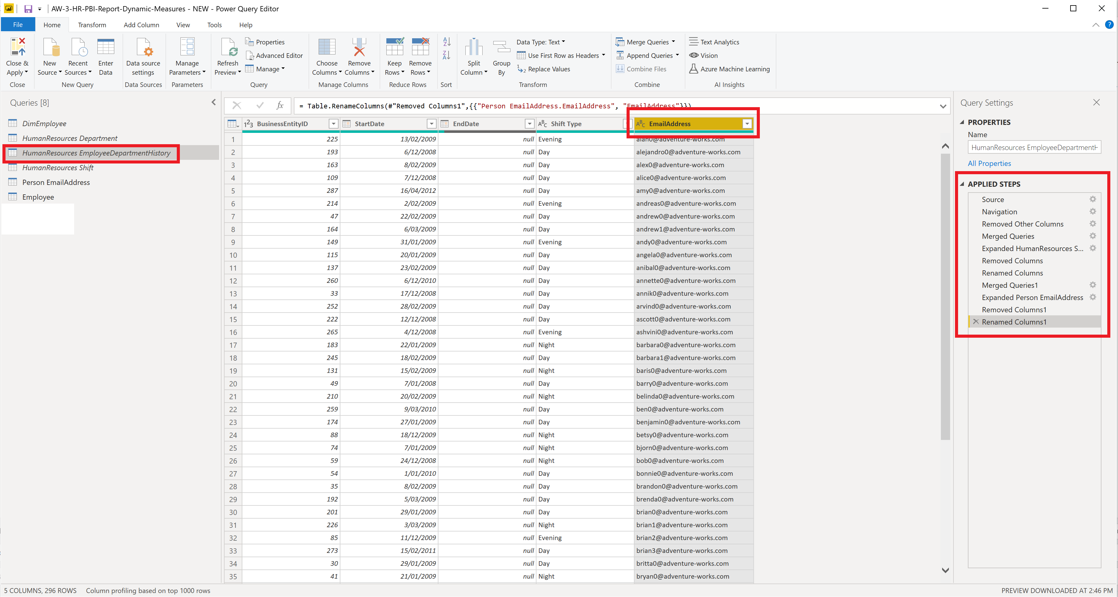
Now we merge the HumanResources EmployeeDepartmentHistory with the Employee table. Please note the numbering in the headers of the columns we merge on. We do not merge on EmployeeKey and BusinessEntityID as they are not the same. We merge these two tables on EmailAddress and EndDate. Once again click on the double arrows in the new column header. Only keep Shift Type, BusinessEntityID and uncheck Use original column name as a prefix this time.
The data contained in the Employee table only contains information about the current employees at Adventure Works Cycles. However, people can have more than one position at the company over time, i.e., an employee changes department or gets promoted. This information is described by the columns StartDate and EndDate, which indicates the start and end date for a particular position. If we only desire the employee information in their current role we could filter EndDate by clicking on the down arrow on the right side of the column name, then select (null) in the drop down menu. Finally, to conclude the preparation of this table we sort by EmployeeKey and convert EmployeeKey and BusinessEntityID to text type.
We can now disable the other tables by right clicking on each table and unselecting Enable load. You may get a warning, but just ignore it, because we won’t be using these tables. Once done, click Close & Apply.
Report Page One: HR Employee Overview
Background
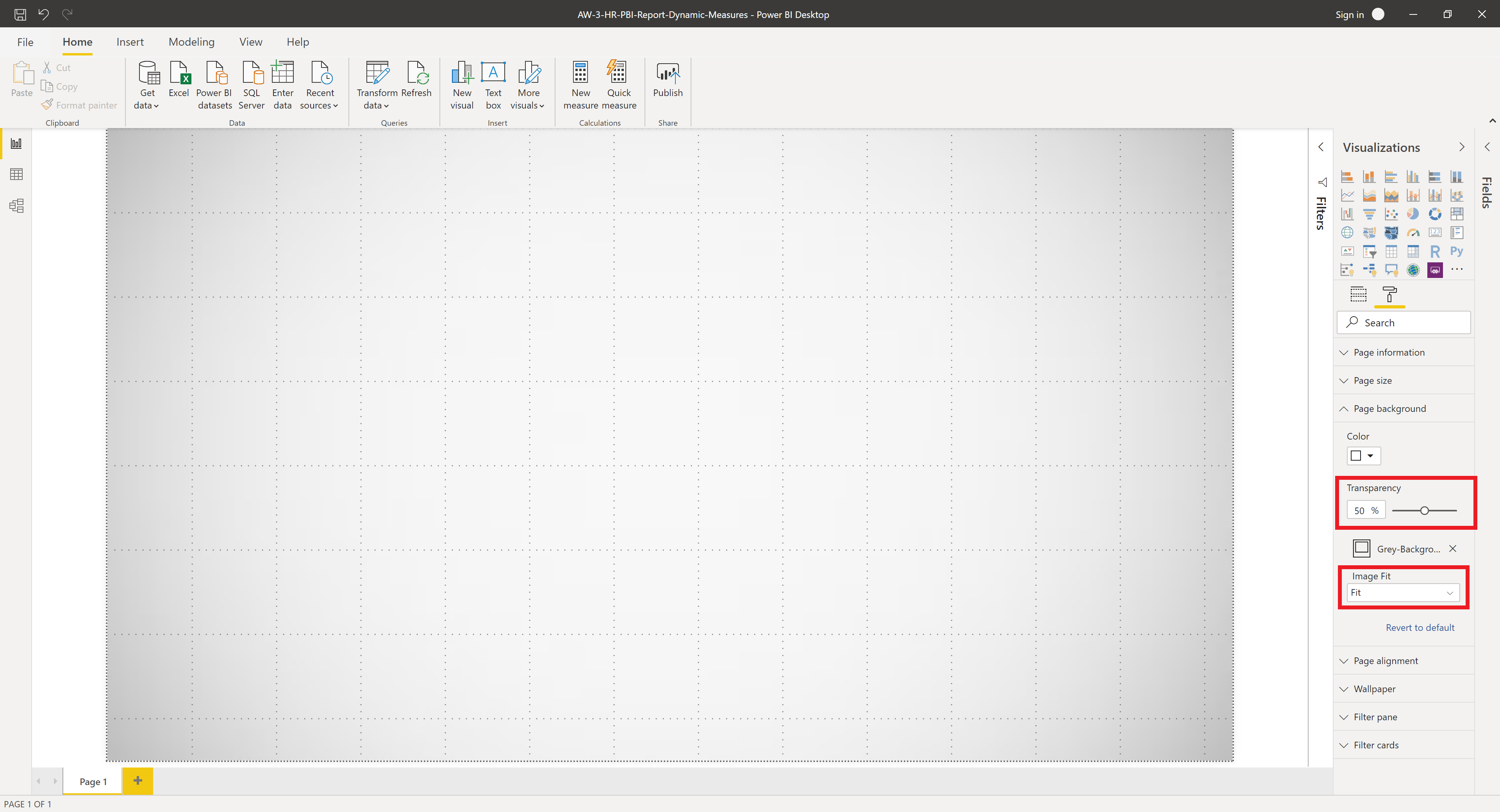
Now we are in a position to begin our report. Let’s start by inculding a simple background image. Go to Visualisations Panel > Form > Page Background then click on + Add Image, then select your image. Here I have used a simple grey background. After which, set transparency to 50% and select “Fit” in the Image Fit dropdown menu.
Theme
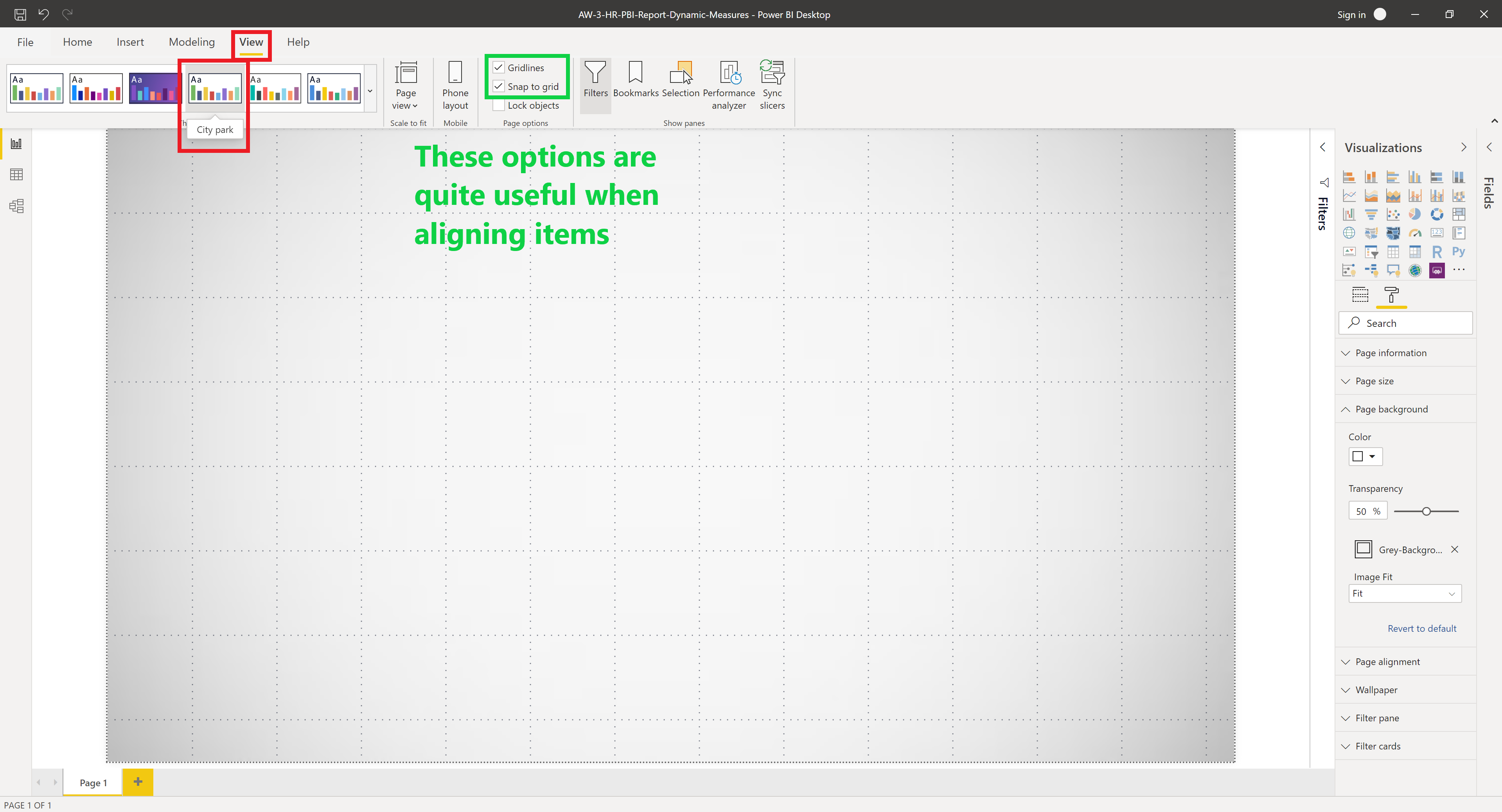
Power BI has many themes to chose from and it’s quite easy to make your own theme. The theme determines the colour palette. To change the theme select View in the ribbon menu and change theme. I have chosen to use “City Park”. Also check “Gridlines” and “Snap to grid” if they are not already selected, these two options will help with the layout of figures later.
Title
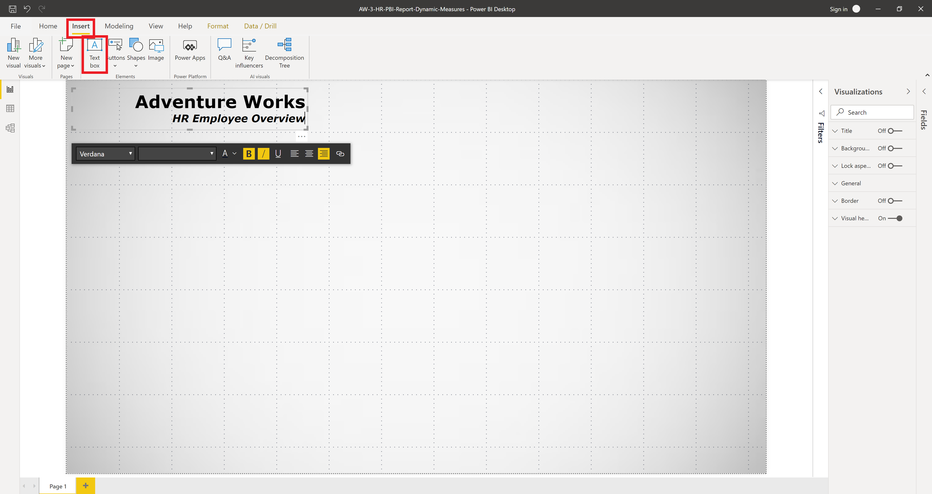
To add a title click Insert in the ribbon menu, then click Text box and add the title text formatted as you like. Every report should have a clear and meaningful title.
Measures
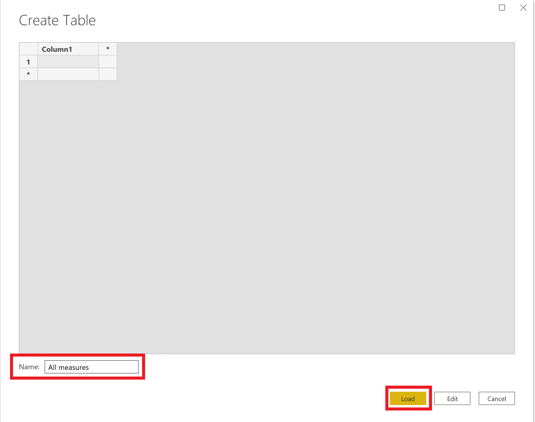
We will now calculate measures to be used in our report. We will begin by creating a new table to hold all of our measures. This is useful, because it makes it easier to find our measures. Click Enter Data to create the empty table we will use to contain all of our measures. We will call it All Measures.
To create a measure in this table, right click on the All Measures table in the Fields panel and click new measure. All the DAX code is given below and also in a separate Excel file available in the repository.
Total Number of Employees
Total Employees =
VAR DC = DISTINCTCOUNT('Employee'[EmployeeKey])
VAR CNT = IF(DC = BLANK(), 0, DC)
RETURN CNT
After adding our first measure we can delete the blank column1 in the All Measures table.
Number of Male Employees
Men = CALCULATE([Total Employees], 'Employee'[Gender] = "M")
Number of Female Employees
Women = CALCULATE([Total Employees], 'Employee'[Gender] = "F")
Average Rate of Pay
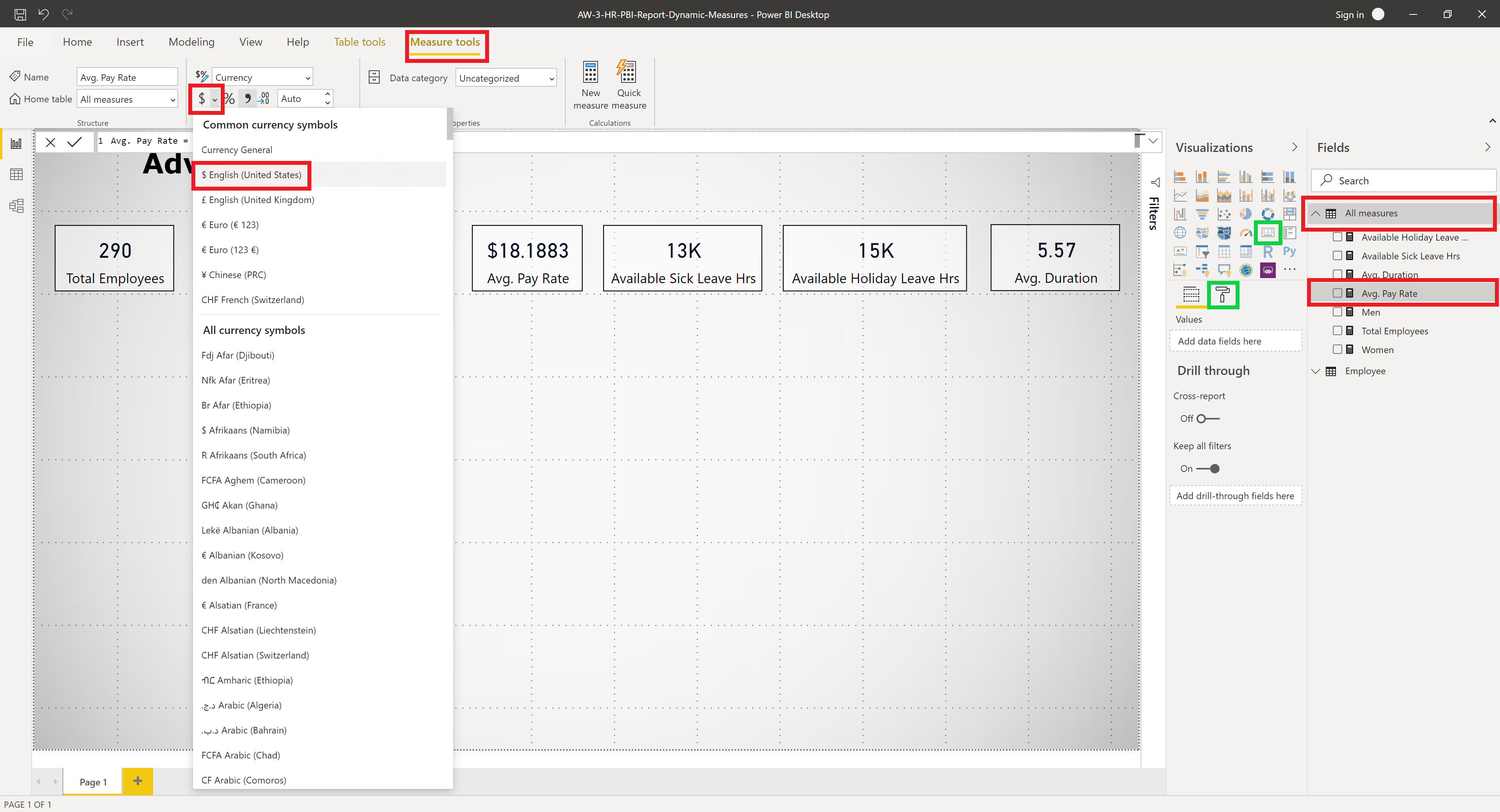
Avg. Pay Rate = AVERAGE('Employee'[BaseRate])
We format this measure to US currency by selecting Measure tools > $ > English (United States)
Number of Available Sick Leave Hours
Available Sick Leave Hrs = SUM('Employee'[SickLeaveHours])
Number of Available Holiday Leave Hours
Available Holiday Leave Hrs = SUM('Employee'[VacationHours])
Average of the Number of Years with the Company
Avg. Duration = AVERAGE('Employee'[Years with Company])
We then proceed to make score cards for each of these measures. This is can be done by going to the Visualisations panel > Score card and placing the measure in the Fields location under the Fields tab which is marked by green. After which the score cards can be formatted as desired using the options in the Format tab. We will not cover this in detail as it is very simple and you may wish to change the appearance as you desire. Experiment with the options available.
Dynamic Measures
Now we have reached the point were we can create dynamic measures. By this we mean we will create a slicer where the buttons are the measures we created above. Upon pressing one of these buttons, the measure used in figures will change.
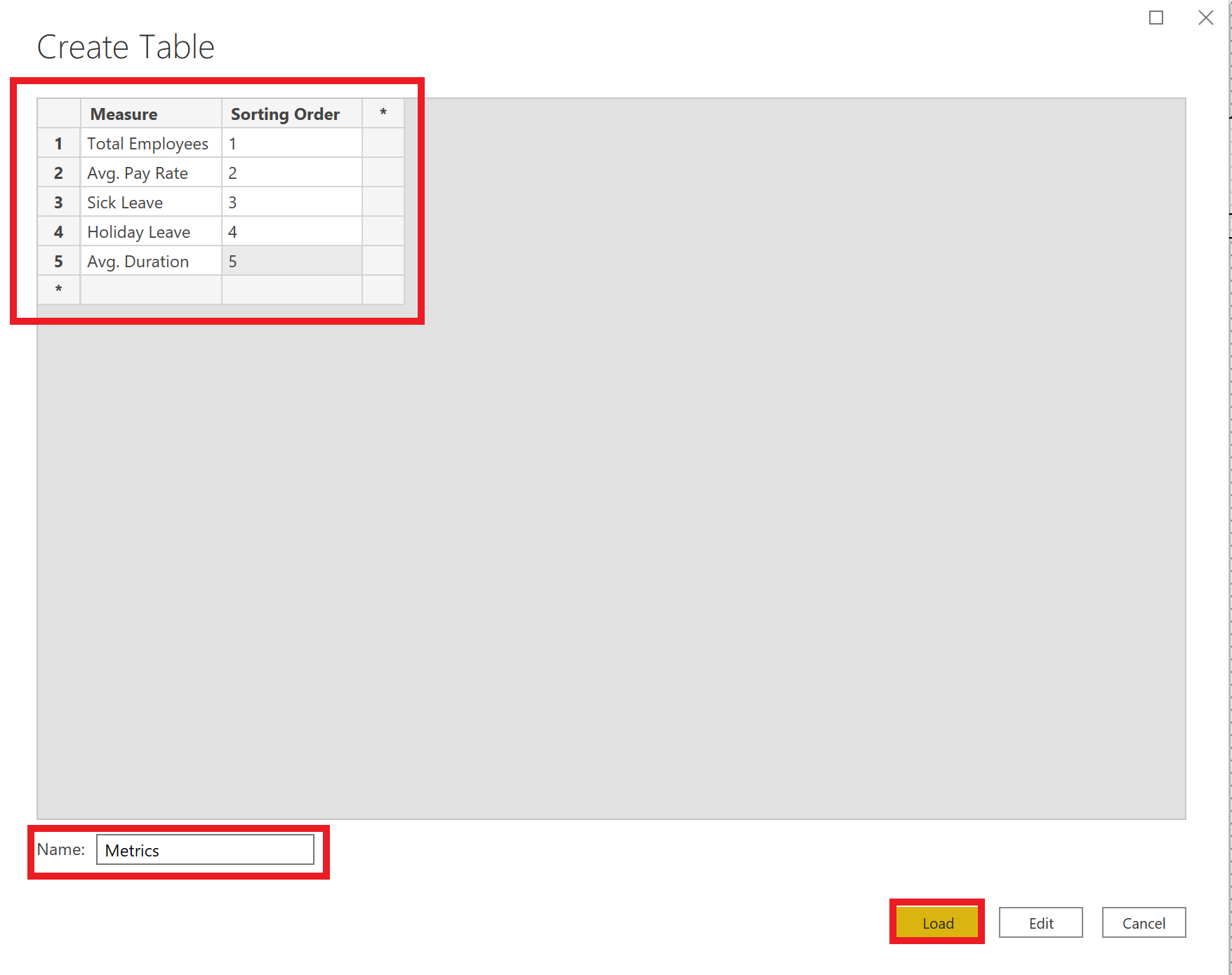
Create a Metrics table by going to Home > Enter data and create two columns Measure and Sorting Ordering, then enter the details as shown below and click Load.
In the Fields panel go to the Metrics table click on Measure column. Go to Column tools > Sort by column > Sorting Order in the ribbon menu. This will sort the measure column by the Sorting Order column.
Create a slicer by selecting the Measure column in the Fields panel and then going to the Visualisations panel and selecting slicer. Go to Format tab > General > Orientation and select “Horizontal”. This will make buttons which we will be able to use to change the measures dynamically. Format these buttons as desired.
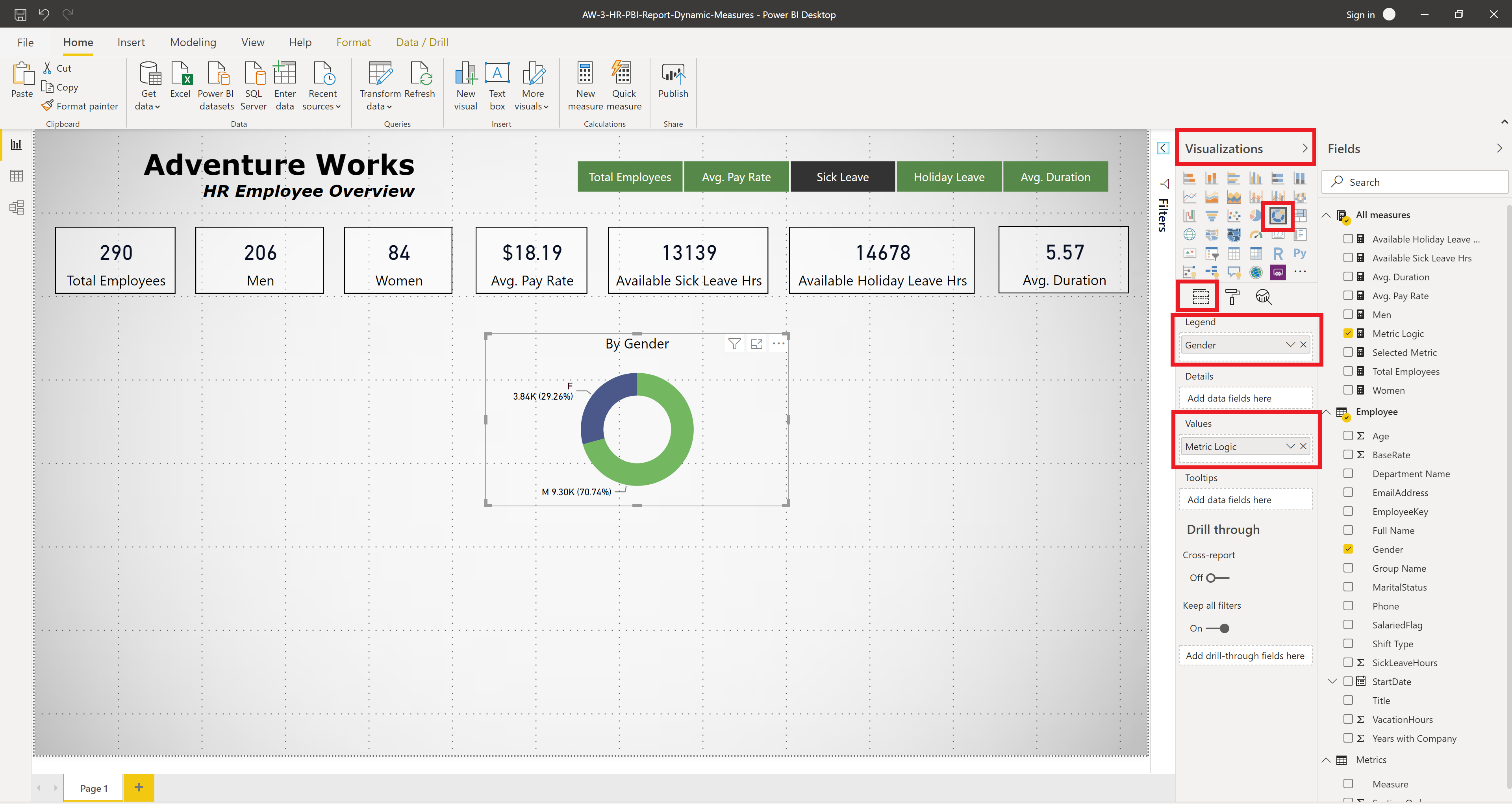
Create a new measure called Selected Metric and set the default to Total Employees. When a button is pressed this measure will return which measure was selected. Here is the DAX code
Selected Metric = SELECTEDVALUE('Metrics'[Measure],"Total Employees")
Create another measure which we have called Measure Logic. This measure will return the correct numerical value of the selected measure. Note that we have explicilty stated the table that these measures are in, but it is not strictly necessary.
Metric Logic = SWITCH(TRUE(),
'All Measures'[Selected Metric] = "Total Employees", 'All Measures'[Total Employees],
'All Measures'[Selected Metric] = "Sick Leave", 'All Measures'[Available Sick Leave Hrs],
'All Measures'[Selected Metric] = "Holiday Leave", 'All Measures'[Available Holiday Leave Hrs],
'All Measures'[Selected Metric] = "Avg. Pay Rate", 'All Measures'[Avg. Pay Rate],
'All Measures'[Selected Metric] = "Avg. Duration", 'All Measures'[Avg. Duration],
'All Measures'[Total Employees])
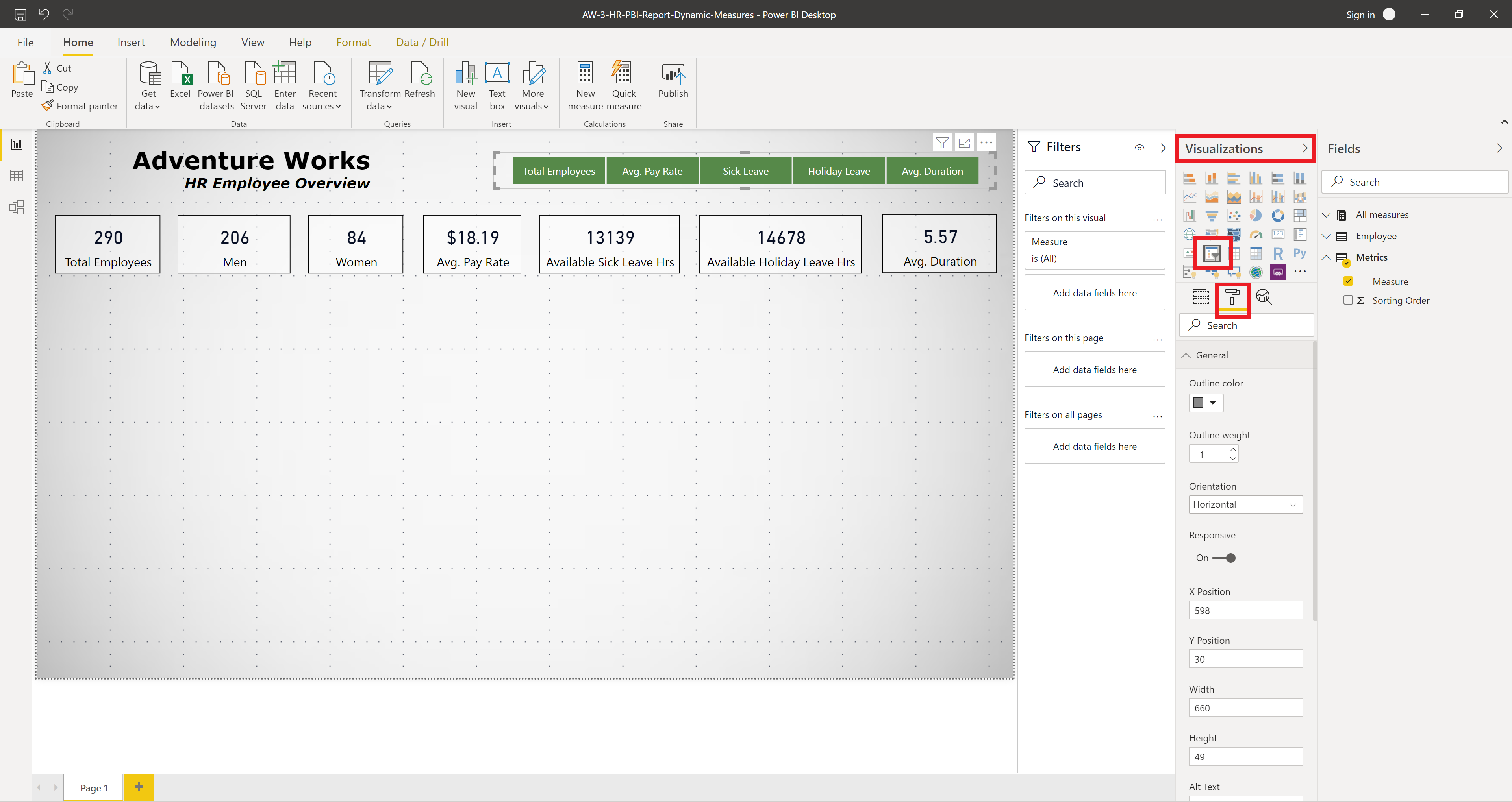
Create a donut chart with Measure Logic and test it out! We have chosen to look at these measures by gender. Go to the Visualisations panel > Donut > Fields tab then put Gender in the Legend field and Metric Logic in the Values field as shown below. We repeat this for Salaried Flag, Marital Status and Shift Type.
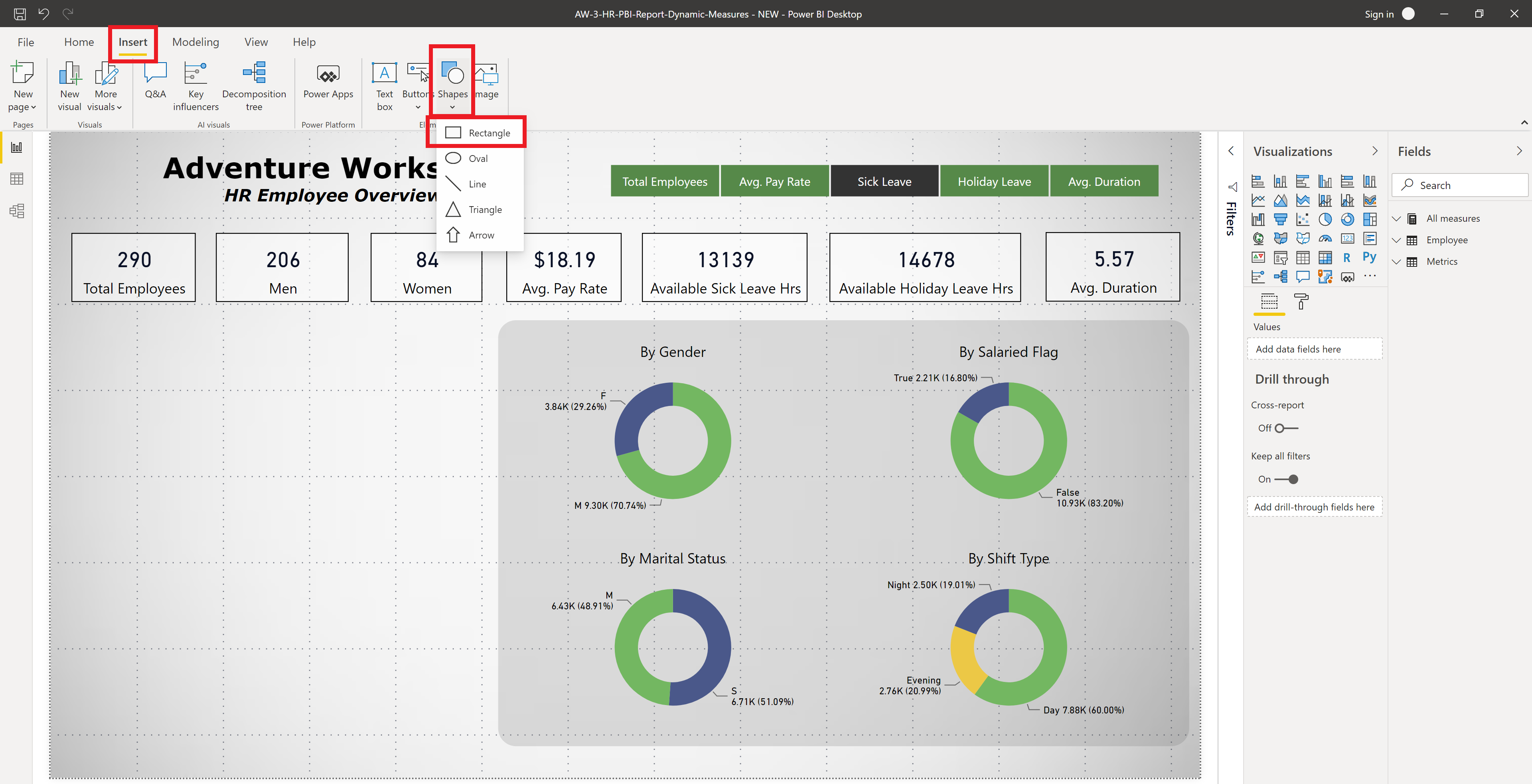
To make these donut charts stand out a bit more we place a slightly transparent rectangle with rounded corners behind them. Go to Insert > Shape > Rectangle. Place the rectangle, go to Format tab > Line change “Weight” to zero to remove border and set “Rounded edges” to 20 px. The Format tab > Fill and select a matching grey colour and set transparency to 80%. Finally go to Format > Send Backward > Send to back in the ribbon menu to place it behind the donut charts.
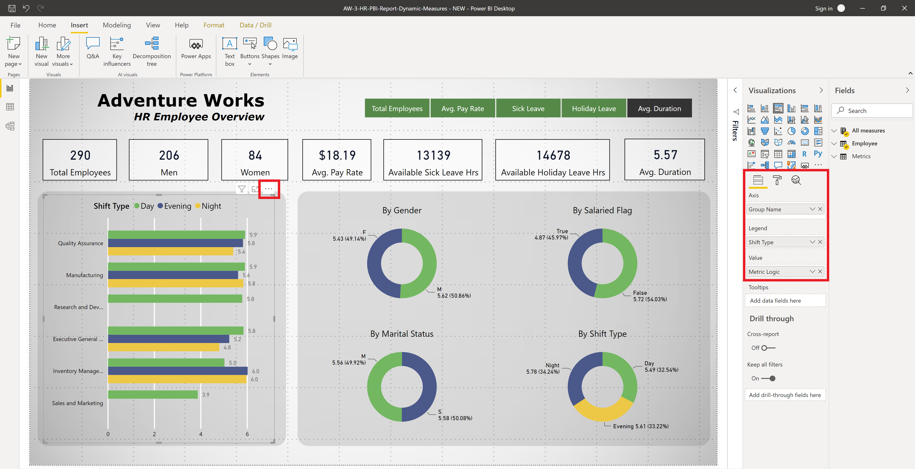
We also create a bar char in a similar manner. Select Visualisations > Clustered bar char, then place Group Name in Axis field, Shift Type in Legend and Metric Logic in Value. Format as desired. To sort we click on the ellipsis (three dots) and go to Sort by > Metric Logic.
We also add a last refreshed date and link to the Adventure Works database samples to the bottom of the page. Normally the last refreshed date would be dynamically calculated by using a measure and a score card, but since there is no recent data and it’s not going to be updated we simply put it as a text box. An information button can be added to the report by going to Insert > Buttons > Information in the ribbon menu. To add text to the button go to “Button Text” and type in the “Button Text” field and format as desired. To make it go to a link, go to “Action”, select Web URL in “Type”, then type the URL in the “Web URL” field. Now while holding Ctrl and left clicking your browser will open the webpage. We have chosen to link to Microsoft’s download page for the Adventure Works sample databases.
We have now completed the first page of our report now we will create two more pages. We will refrain from repeating many of the steps discussed above.
Report Page Two: HR Employee Analysis
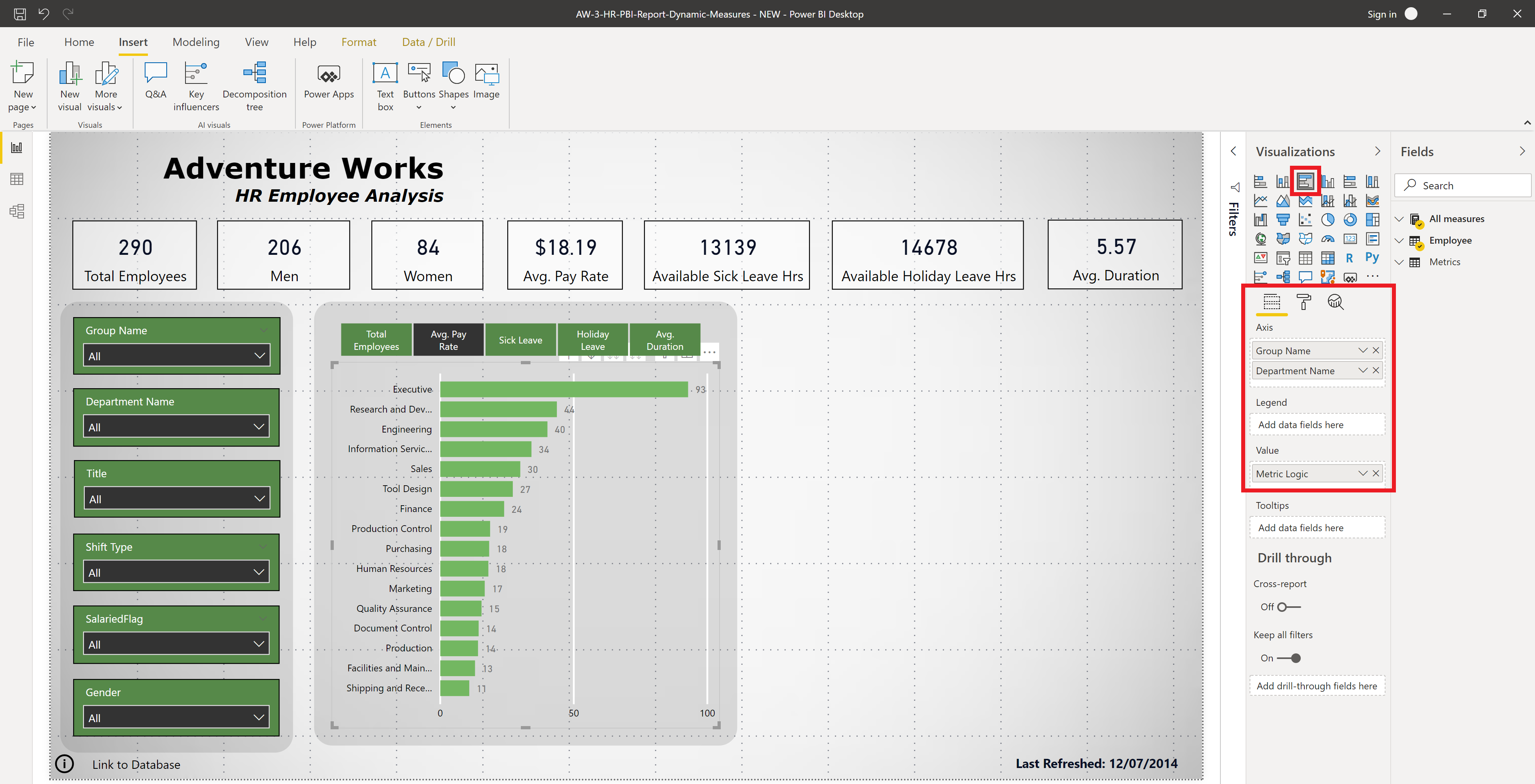
We can duplicate the previous page by right clicking on the page name at the bottom and selecting Duplicate Page. We will delete the donut visuals, but keep everything else. This report page will be used to do interactive analysis, so we will create multiple dropdown menus allowing us to change the data which is used in the visuals. These are created by selecting Visualisations panel > Slicer then placing your desired attribute in the “Fields” field. On the slicer, click on the down arrow in the top right corner and select dropdown. Format as desired. For the bar chart we will remove the Shift Type field from the legend and place the dynamic measure buttons above this figure because this visual will be the only one that will be dynamically changing. We will also add Department Name to the Axis field under Group Name.
We will now create a scatter plot to show the relationship between the two measures Avg. Pay Rate and the Avg. Duration (the average length of time employees stay with the company in years). Go to Visualisations panel > Scatter and add fields as shown in the figure. Note that we have placed BusinessEntityID in the “Details” field to show each employee in the figure and we have colour coded the data points by the group to which they belong by placing Group Name in the “Legend” field.
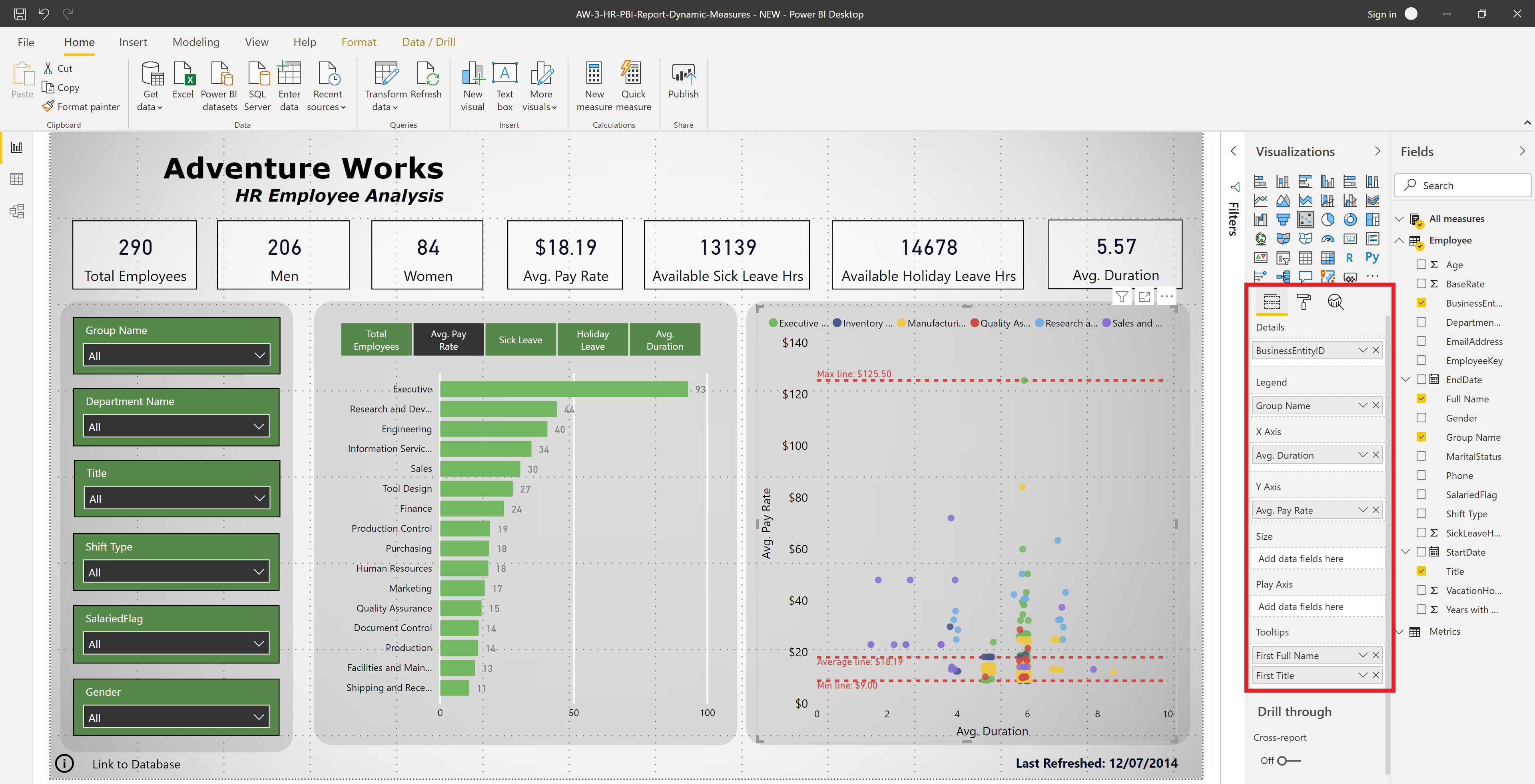
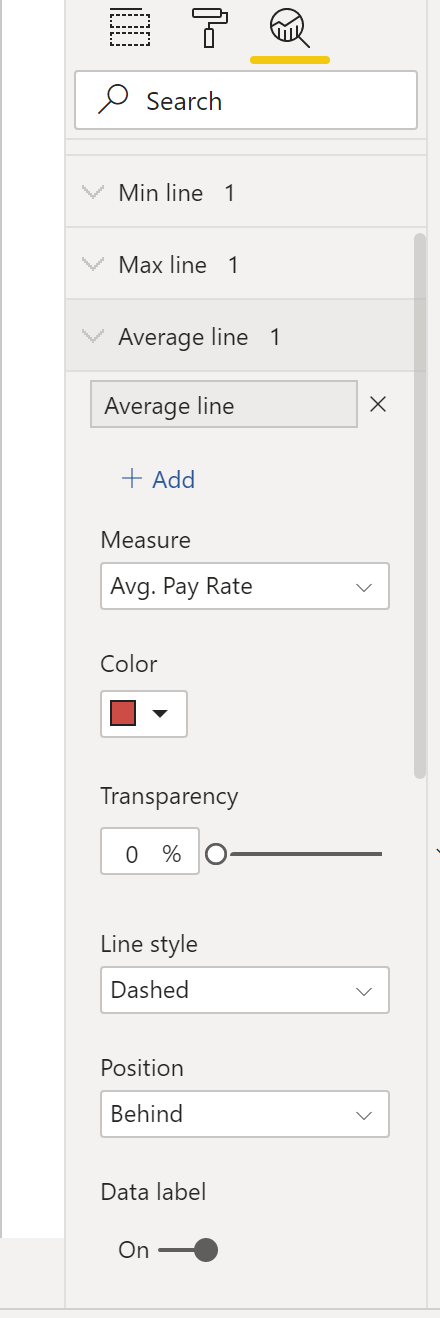
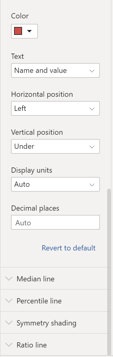
This figure has been improved further by going to the Analytics tab and adding a minimum, maximum and an average line, e.g., Analytics tab > Min line click + Add, select the measure Avg. Pay Rate, select “Position” to be behind, turn data label on, set text to “Name and value” and format as you like.
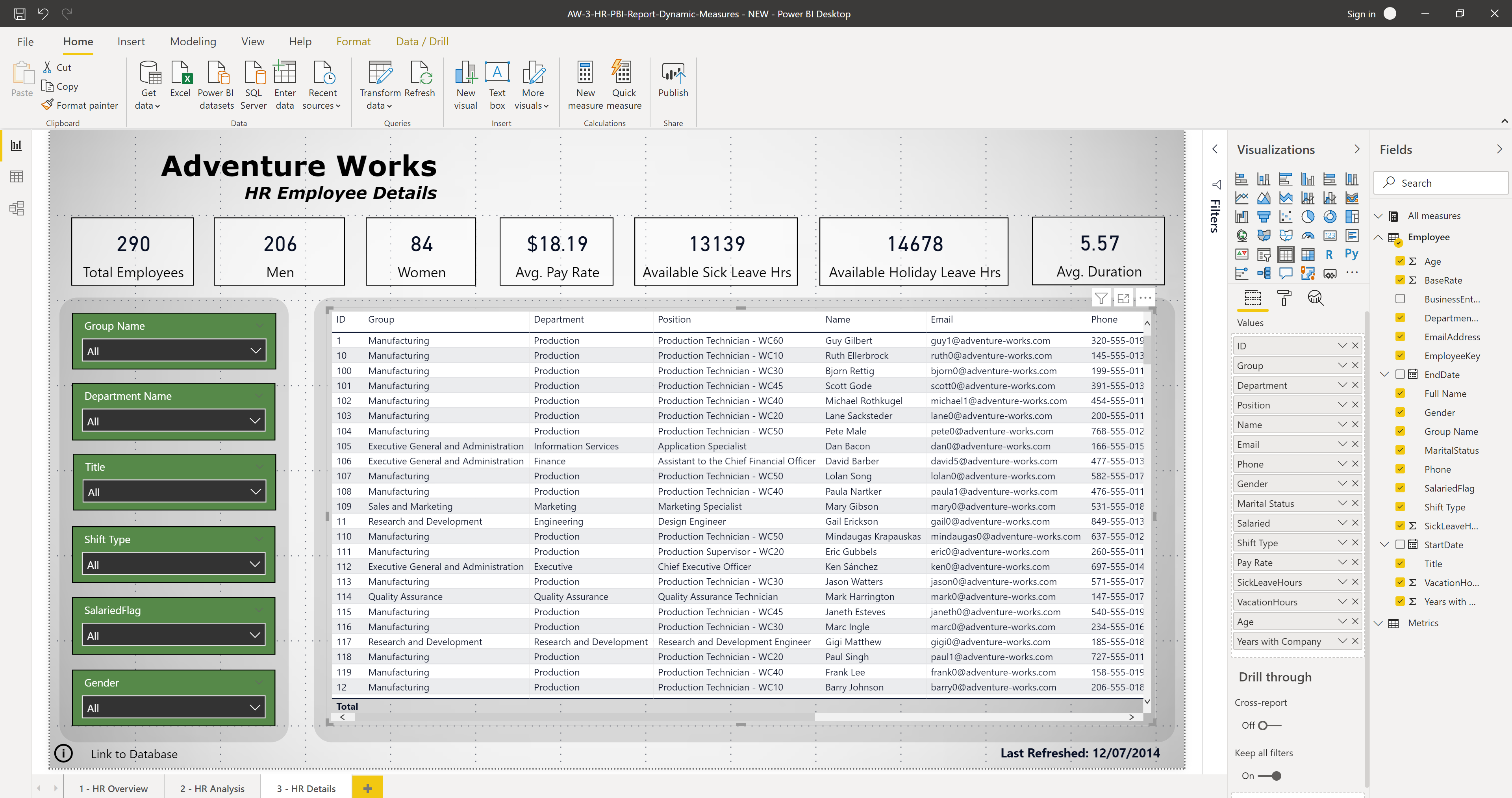
Report Page Three: HR Employee Details
The third and final page will be similar to page two, except in stead of visuals we will include a table containing employee details. We begin by duplicating page 2 and deleting the visualisations. To create the table go to Visualisations panel > Table. Add the following fields to the “Values” field and format as desired. Note that we have changed the field names to be shorter and more descriptive in some cases.
Conclusion
In this post we have looked at creating a simple Power BI report for HR using the Adventure Works sample databases. You can find the Power BI file on my GitHub account in my Adventure Works repository. I will also place all the screenshots taken while constructing the report, many of which were not included above. Included in this repository is also an excel file with all the measure formulas.